In the latest update we’ve have some new dashboard features added to the platform. As all the data in RunMags is in one single repository, we can now build any kind of dashboard that our users like to see. As long as the data is in RunMags, we can slide and dice it for presentation in a way that makes sense for human beings.
To start with we have created one dashboard for Sales insight and one for Financial insight that can be accessed in the left hand navigation menu. Soon we will also release dashboards for Production and Marketing. Use the little feedback icon (shaped like light bulb) at the lower left of the RunMags user interface to share your thoughts on what you’d like to see. Think about what makes sense for you and your business. Let us know and we’ll create it!
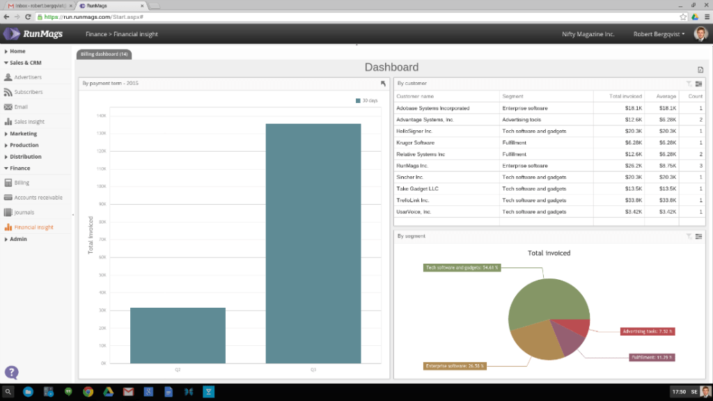
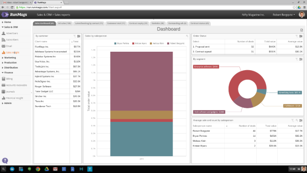
RunMags Dashboard Sales Insight
Data presented for different purpose and consumers
As you let your imagination run free, think about what your various users need to be great at their job. A dashboard may not always be the best tool. Sometimes our Reporting Lists and Pivot Tables are more effective for detailed reporting and ad hoc analysis.
Think of a dashboard as a tool that you continuously come back to check the status of something. It is a very effective tool for weekly meetings with the staff or for presenting to the Board of Directors. If the format is familiar, it is easy for all involved parties to understand what the data is showing and to draw conclusions from it.